The man who made pharmaceuticals beautiful
Pharmaceutical packaging in the 1960s faced a wonderful challenge: how to help companies connect with patients in a simple, direct way. Complex concepts, unpronounceable substance names—the communication problem was brutal.
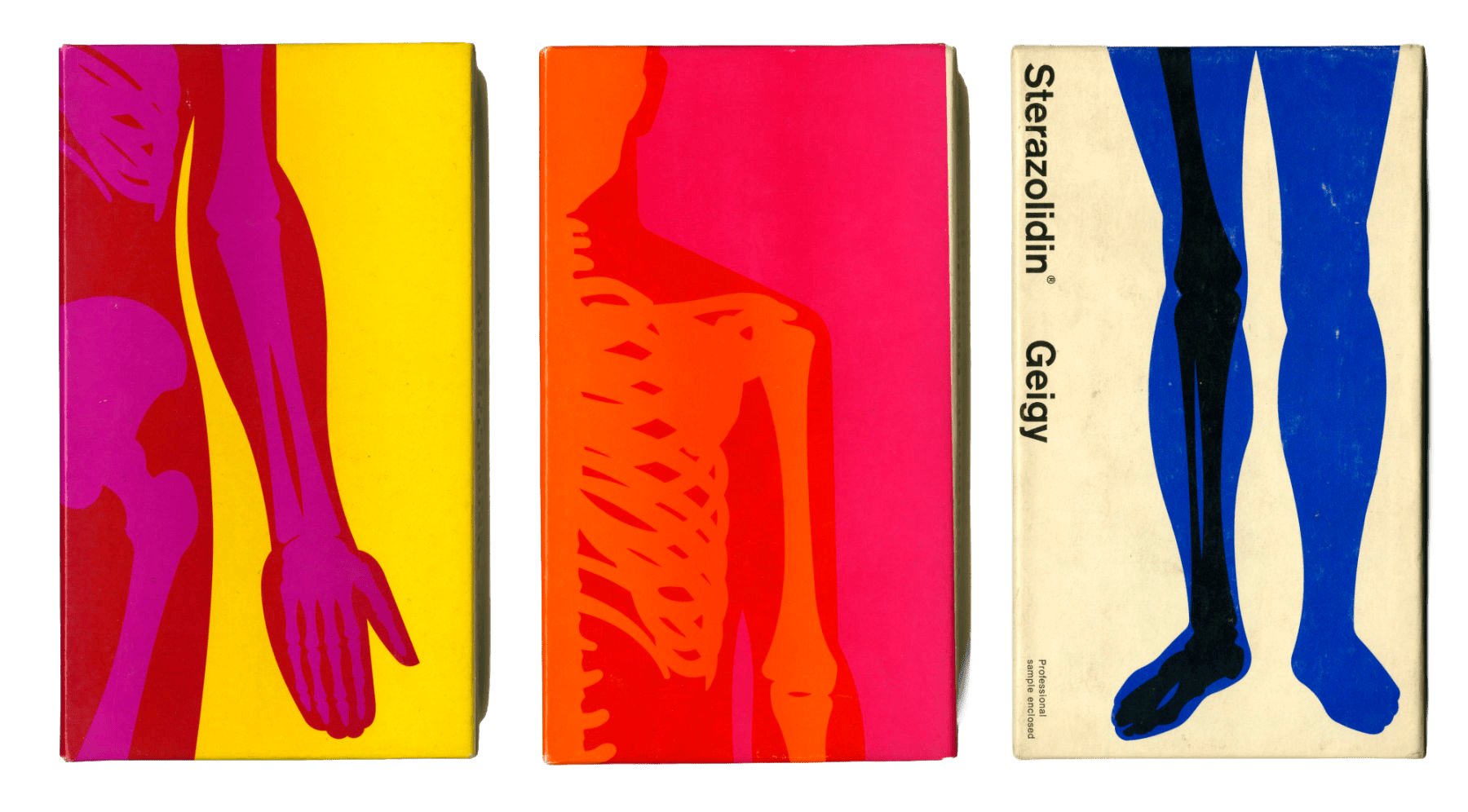
Fred Troller pioneered the solution, working for pharmaceutical company Geigy and developing a totally revolutionary image in pure Swiss style. Sans serif typography, geometries, visual metaphors, experimental photography, saturated color contrasts—all started consolidating as a visual language.
Troller understood that pharmaceutical packaging didn't have to be boring or intimidating. He transformed medicine boxes into graphic pieces that communicated with clarity and beauty. Anatomical illustrations became abstract. Blue legs, red arms on saturated backgrounds—every element had a function and an aesthetic intention.
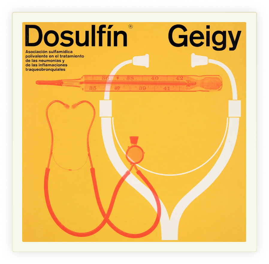

What made his work radical was the method. Troller didn't just apply Swiss design principles to medicine—he reimagined how patients could understand their treatments. The boxes became teaching tools. A glance at the shelf told you what the medicine did and how it worked.
This visual language became known as "Geigy Style" and set the foundations for how the pharmaceutical industry communicates today. A perfect example of how Swiss design didn't just organize information—it made it memorable.

"The object was to communicate logically, vividly and without ambiguity" — Fred Troller
All images © their respective photographers and creators. All rights reserved.